


CHOOSING YOUR COLOR //
THE REALLY FUN part of planning your session is choosing your outfits and color scheme, but it can be daunting too! Clients often ask us what color to wear, and are concerned that they might not be great at piecing it together. You might feel the pressure because the truth is, color really does matter. In fact, colors are an essential part of your imagery and can either make or break your photos.
As one of the most important parts of an image, color will impact emotions and interest unlike almost any other part of photography. Colors are tools that we can use draw attention to certain parts of the photo, distract from others, and especially influence the mood and overall feeling of an image.
There are a lot of variables that will affect the mood of a photo like location, weather and lighting, but taking the time to consider what your dream photos feel like and then choosing colors that will best represent that will do wonders for the outcome. Do you want your image to feel soft and romantic? Dramatic or intense? Happy and carefree? Peaceful or calm? Think about these things and choose your colors.

THE COLOR WHEEL //
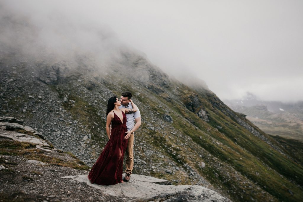
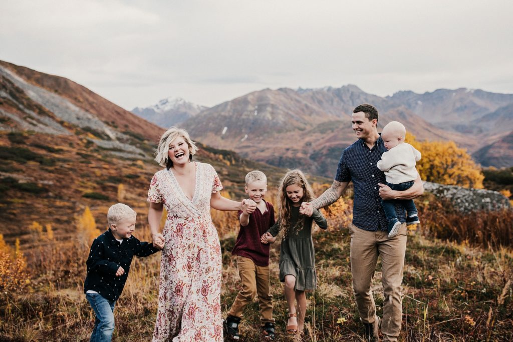
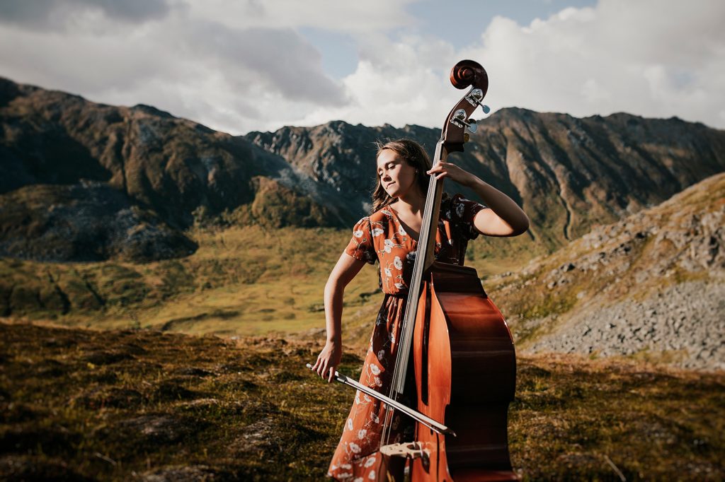
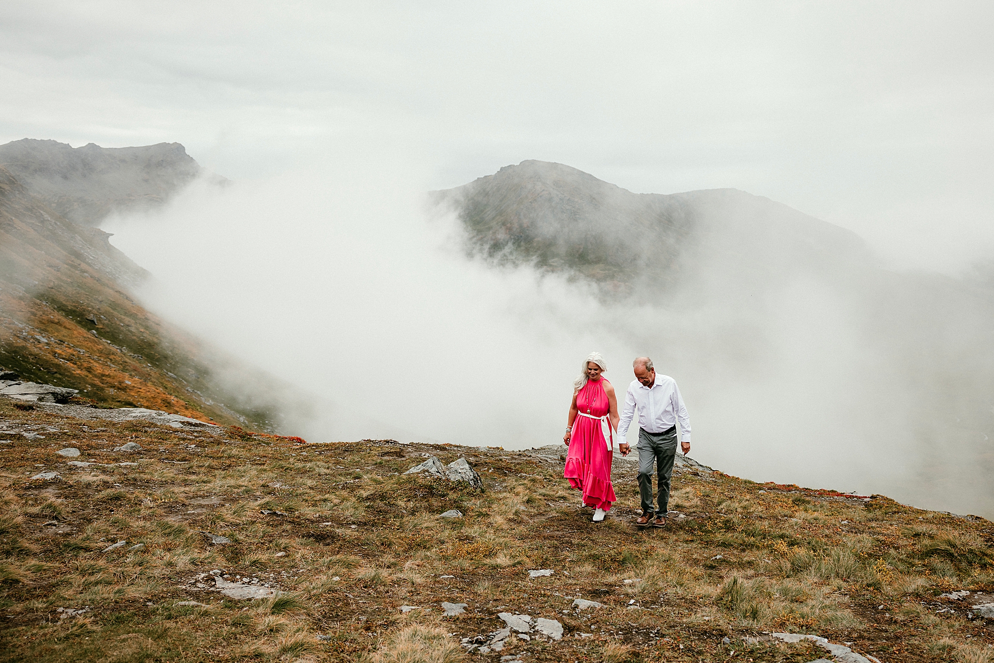
THERE’S A REASON this red dress looks stunning against the blue-gray slate and green moss of the mountain side. It’s so simple and it’s all about the color wheel! When choosing your outfits, it is so important to consider both the location you will be photographed in and the time of year.
If we are shooting in a field of orange and yellow wildflowers, we will probably suggest wearing complimentary soft blue tones with added neutrals to give the flowers the bold lead. Or if your session is in the dead of winter, when they whole world looks blue and gray, we will encourage reds and rusts to balance things out.
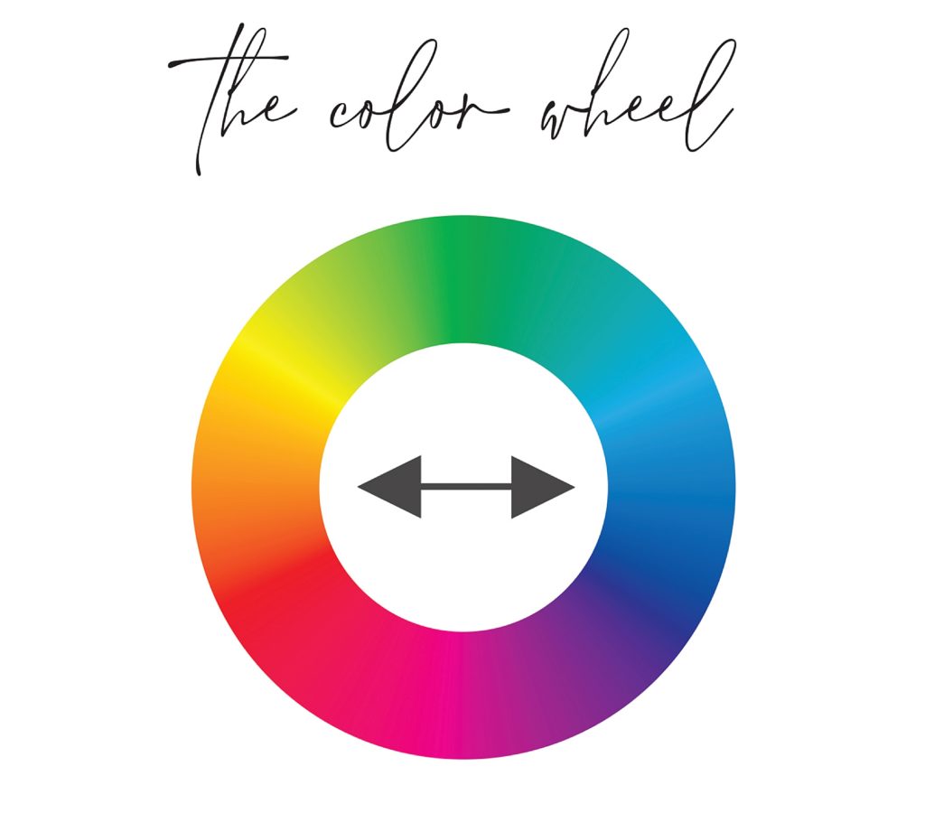
THE COLOR WHEEL will change your life! It is an amazing tool that will allow you to effortlessly find color harmonies. To find a complimentary color scheme, simply choose a color, then find the color directly across from it on the circle. Opposites attract is a living law.
The complimentary color schemes you’ll find most recognizable are red/green, blue/orange, and yellow/purple. Bold colors can enhance one another but they also have to potential to overwhelm, especially if there are several family members competing. Here are a few rules of thumb for you to master the balancing act:
1) CHOOSE A LEAD color as a foundational piece. This color will be the backbone of your set.
2) CHOOSE AN ACCENT color or choose a few. You only need a small amount of color to stand against the lead.
3) SOFTEN your choices if they are still competing for attention by adding neutral tones. Creams, soft whites, and various shades of gray will tamp down the contrast of high intensity color.
POWER OF COLOR //
HAVE YOU EVER noticed that colors make you feel a certain way? A blank white room might feel sterile or cold, or dark walls may crowd you? Some colors feel stressful to you while others calm and relax you? Color is often associated with emotion, so much so that color is a main ingredient of art therapy. Studies have even shown that some people have an increased heart rate and adrenaline levels after looking at red for a period of time. Amazing!
In general, warm colors tend to spark a variety of emotions ranging from comfort and warmth to hostility and anger. Cool colors are more often associated with feelings of calmness, peace, and sometimes even sadness. This definitely impacts the tone of your images, and it is worth your while to understand the power of the colors you choose to put together.
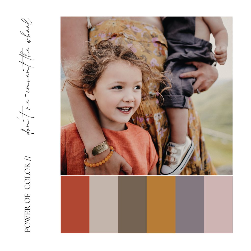
THE COLOR WHEEL has already been invented, so there is no sense in doing it again! We suggest paying a visit to your local paint store to find some color inspiration. They will have endless supplies of color swatches for you to sort through. Mix, match and find a combo that looks and feels like what you are going for. Take the swatches shopping with you, choose outfits that coordinate with your desired colors and voila! You’ll have a stunning combo.
THE MEANING OF COLOR //
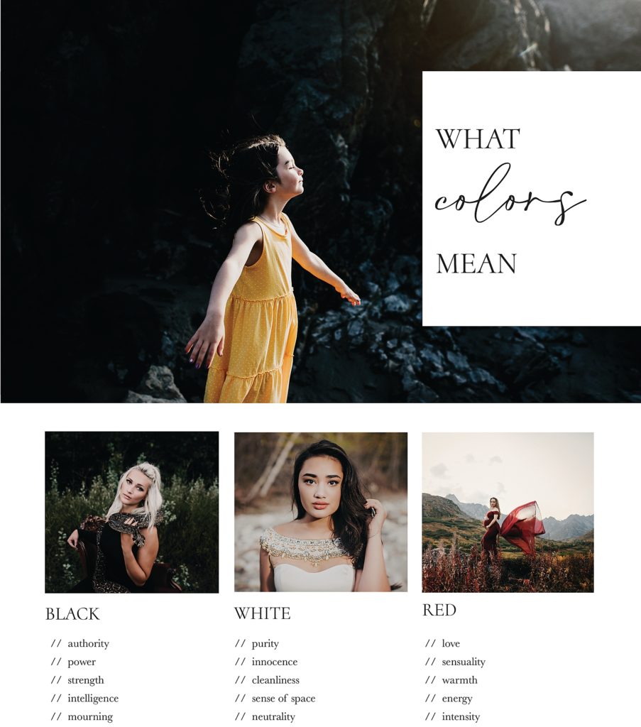
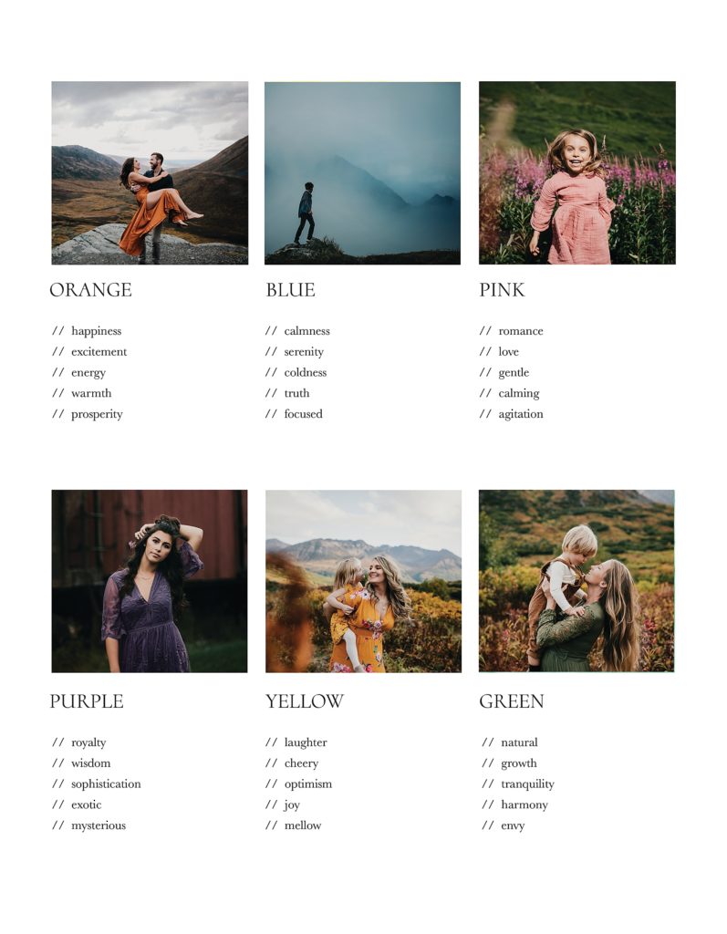
TO SUM IT UP: Don’t be scared of color! Have fun with this part of planning your session. Choose colors that represent who-you-are and what you want your images to look like. We can’t wait to see what you come up with.


")


")

